Sunday, July 20, 2025

Redo from Day 4 ("Gifts" poem)

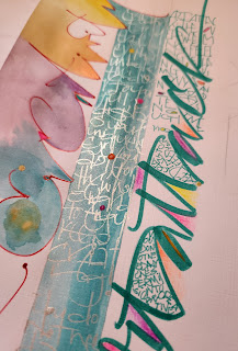
Here is my new, improved redo from Day 4 of the "Speak to Me..." class. Same poem, same words, just planned out a little better.


Again, I first masked off the areas for the smaller writing (this time, more evenly spaced out and covering both ends), and then lettered big with my slant tip Pilot, using FW Press indigo ink.


I wanted it to be abstract lettering, so i purposely did overlapping. It says, "Over the years, I have been given several opportunities for learning..." (but learning got cut off. this is NOT part of my poem)

Removed tape.

 
Small lettering with my "new" FWPress fountain pen! (Decided to treat myself to this tool, as I kinda wanted one, and it was rather inexpensive. Although mostly fun to write with, I do not like the short barrel. But I love how it flows and holds ink.)

Used Enviro lettering, and dark pink gouache


I am getting SO many ideas!!  💕

Friday, July 18, 2025

Day 4, "Speak to Me..." -- Patterns

I cannot get over how much fun this class is!!!
Today's theme was Patterns, and this could be done in such a myriad of ways:  Patterns in Nature (which was the focus of class), but also, Patterns in life. (i.e. those bad habits that keep us stuck, hindering growth)

The poem she read lead to pondering about Gifts....
Again, I used my own words and musings in my lettering (small red script at the bottom)

Close-up of masking technique. I first lettered words using sepia India ink and a pointed Pentel brush pen, as well as my ruling pen. I used India ink, so it wouldn't smear or "erase" when I added the top  color of indigo fountain pen ink (Ferris Wheel Press).

Full pic. Used my own words & musings about nature and patterns. (May duplicate in my Art Journal).


More angles, so you can see the base lettering.
 

I love how the iridescent top layer of ink makes the base words look metallic.

Somewhat "full page" from Day 4
(the dots under the masked leaves were done with a Q-tip) -- cannot remember what they're suppose to represent.

Again, wrote connected caps for a warm up, getting bigger toward the bottom (I added colors, and also painted over with the top layer of indigo ink).

I also filled in the blocks from Day 3 with more colors and values. I tried writing, "Nature Glimmers" in white crayon first (for masking), but it didn't show up very well.

Closer. You can barely see "ature" and "mers".

Another warm-up where we wrote freely with our own handwriting, but since I wrote in water-soluble ink, it vanished when I added the blue. BUT I LOVE how it turned out!!

Close-up of layered script writing with Glaze gel pen (clear).

Another close up. I added some red. Fun!

Another technique (more masking). I first applied removeable tape (thin strips), then lettered over with a Pentel pointed brush. (Words: "Over the years, i have been given many gifts...")

I then removed the tape, and added lettering in-between.

script lettering with my fountain pen and red gouache.
I also filled in some counters by smearing the Pentel ink and adding red accents.

close ups.


Again, my own words. Original poem titled, "(Not so Obvious) Gifts".

And, as per usual, I plan to redo, as I'm not happy with how this one turned out. (will post new one!)

I also want to do something with this, as I took this pic in Jan. of 2023. I loved the scribbly pattern the limbs (or whatever they're called) made, and actually tried creating an abstract art piece, but it was a fail. Will post when I make something!

Monday, July 14, 2025

"collaged" envelope -- (L. Doctor inspo!)

I'm on such a roll with this "technique" from Laurie's class that I even decorated an envelope, to match the stamp too!

I used different "creativity" quotes, in which I lettered in the middle column (pp and metallic ink), and some in the Right column too, in-between the letters of "art attack". (just the other end of the brush marker -- fine point)

I lettered, "creativity" in the Left column, using a red Glaze gel pen, and colored in with watercolor (linen paper).

I used neon color pencils for "art attack", then added some color dots as accents.


I love this view.


*Will post an update when i decide who to send to!

Friday, July 11, 2025

Insert (extra w/c piece)

I love taking scrap papers (or failed pieces!) and finding clever ways to re-purpose them. This one is from an "experimental" w/c from my Art & Movement class at the Art Center:

I didn't like that piece at all, so I sectioned off parts that I found salvageable and turned them into snail mail inserts. (see before piece below)

I used extra fine pt Poscas, and lettered parts of the "Invitation" poem by Mary Oliver (although I wish I had lettered something about "growth" instead).


I really love this part, as to me, it looks a bit like a flower and/or water/waves. If the blue part was green, then it'd resemble grasses more. I could have probably made it green, but I love the blue too.
And although the lettering is more abstract and "illegible" I love the look of the script.

Close up


Before pics
I found this section so pretty, and at first, wasn't sure which was to use it. But decided this the best, b/c of how it resembles a flower.


I also remembered to use my tracing paper for the layout! (a lot of times, I'd just "letter" in pencil right on the piece itself, then erase.)

I plan to duplicate this and use a poem about growth. (and maybe keep for myself and frame it!)  ;)😊


Tuesday, July 8, 2025

Tall Grasses ("Invitation" by M. Oliver)

So, this is the redo from Day 3 of Laurie Doctor's class:

And can I just say how wonderful this turned out??? 😄😌😊


I am so proud of this piece, and it was so lovely and freeing to create. I hope it does, in fact, depict tall grasses and the parts of Mary Oliver's poem I lettered. (see below)

As in Laurie's class, I started with pointed brush lettering using an old used Pentel brush pen, and watercolor (greens and mustard yellow).
The writing says, "invitation to the tall grasses, blowing gently in the breeze, watch them sway."


Then, using my Rubinato Copper nib, I added lines from Mary's poem (darker green w/c and walnut inks). The lines I chose to letter:

"do you have the time to linger
for just a little while
out of your busy and very important day...
for sheer delight and gratitude...
just to be alive...
in the broken world.
do not walk by without pausing...
it could mean something.
it could mean everything."


You can barely see, but I used metallic gold ink to letter, "It could mean everything.", to emphasize that line.

I then, also lettered it at the bottom to the left a bit, to help depict grass on the ground.

Some close-ups

I could totally see using a Fineliner with this as well.


A big THANK YOU to Laurie for offering this class online! It's really gotten my creative juices flowing once again!

Sunday, July 6, 2025

Day 3 (L. Doctor, "Speak to Me..."), Movement

 Laurie's class is SO inspiring...right up my alley.

(And just to share how so, she starts out with a somewhat meditative part, grounding us, and focusing on our breath, then reads a poem that fits the theme. Her voice is also very calming, and it really sets the tone. Reminds me a bit of my Journal Challenge with Nadia Coburn.) *At times, I may even go for a quick nature walk before I start in, just to get more inspired, as that helps my creativity.

Today's theme was "Movement".

I'm showing this piece first, as i just thought the cropped part of it looked cool.

and here's the full part of this section (on its side). Using our own handwriting and a fine point black pen, we were to write in somewhat script format, while really focusing on lengthening the ascenders and descenders. (I have too many loops.) We were also to try and move our whole arm, to really get that flow going. 
My only struggle with this, is that I work better if I have something specific to letter vs. just words. If we're to letter just words, i find myself thinking to much of what to letter.


Here is the full practice sheet, but with touch-ups.

And before.

We started out with "waves" or rolling hills (upper left) in pencil. I then went back and erased, and using 2 B-nibs (5&6), went over the words with navy blue FWPress ink, trying to alternate thick and thin. (*this reminded me a bit of my "Waves" piece from earlier this year: https://foldedpenfan.blogspot.com/2025/05/waves.html -- totally fits with the theme.)

Close up, where I filled in with ink.
(I started with words, reminiscent of the ocean, but then just started writing whatever came to mind.)

The next part (Top Right) was filling in 1" squares with varying shades of yellows and greens (mixing from the blues of Days 1 & 2.


Next was the black pen (Lower Left, b/4 touch-ups), and finally, using my Pentel pointed brush and the yellows and green w/c's, lettered marks and words to represent tall grasses (Bottom Right). I forgot to take a pic with just the brush, as I added script lettering over it, using my Nikko G pointed pen and darker green w/c ink as well as some walnut ink.

Close up after touch-ups.

I wasn't sure what to letter, until I read the poem, "Invitation", by Mary Oliver. I found it perfect!
*Laurie actually read another Mary Oliver poem, one that was quite long, but I cannot remember the name. I then went and read a few more of her poems, and found them lovely, so much so, i hope to letter a few in the future.


Here is a closer look. I plan to redo, but found this not bad!
*I actually did redo, and will post separately, later!

close up.

another close up.


I only have 2 more days, and will be so bummed when it's over. BUT I'm glad I have lifetime access, as I can always redo and maybe find more inspo!


*This class (Day 3) also inspired yet ANOTHER original poem from me, as she asked us to reflect on "Who am I?" So, I started writing some musings on this, but instead, a poem emerged! (entitled, "I Am...") -- will share my work for it later!