Day 2 was a bit more tricky than Day 1, but still so much fun!
Day 2 was about Value. We were to make varying shades of blue watercolor, and also use a writing tool found in nature. I did not have anything from nature to use, so I just used one of my new W&N pointed brushes. A bit hard, but not bad.

We started out with the lightest shade (pretty much just water), then added more color as we went down the column (actually, the first 2 columns are more toward the bottom, so scroll! *But i'm showing these first, as they look nicer.)
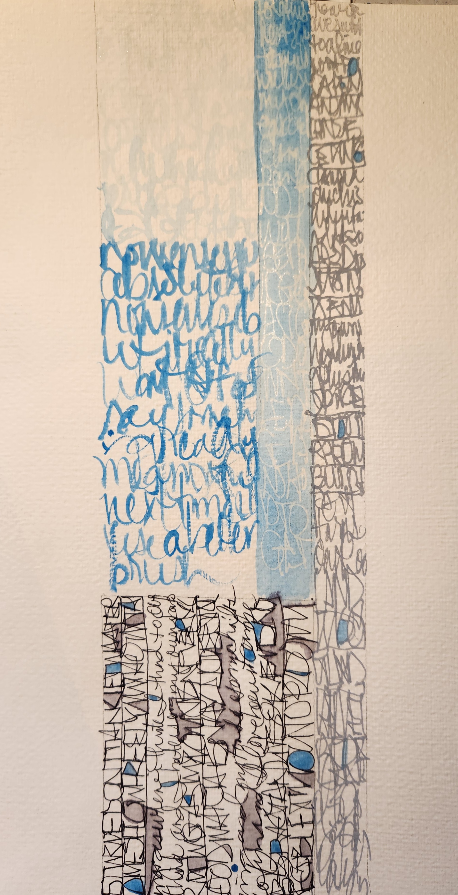
We then did more columns using other tools, and incorporating scale. *The left column is my original and the Right is where i touched it up.
Left to Right: 1) pointed brush & w/c, 2) Clear Glaze gel pen then used w/c over (you can see I did darker values at the top & bottom, creating a somewhat gradation), 3) grey Posca, trying to increase the lettering at the bottom (bigger), then brushed over in grey at the bottom; 4) alternating between connected caps and our own handwriting (fine pt black pen)
I then added more effects as I did for the practice sheets on Day 1 (filling in neg. spaces, outlining, etc.)
Fun!

close up. I struggled with my left column in slightly increasing the blue. (See? Tricky!)\

another close up. Fun how the ink bleeds. I also added w/c ink to the Posca column, to rep. more value.

These are the original 1st run practice columns.
Not bad, but hard to letter with my brush.

Since I didn't like them, I decided to paint over and add my own lettering/ musings /prose of "what is healing?"

Top: I scratched in the word, "healing" while still wet, then when dry, added some lettering with 2 Glaze pens. After all dried, I added this velum overlay, again using a light blue Glaze gel.

You can see the words here. I don't like the smaller ones done with the Glaze pen, as they conflict with the big word (but that's also representative of scale!)

Bottom part:
Using the same light blue Glaze, I lettered my thoughts on healing. I love how it fades upward, almost rising (representing healing to me).

On its side, I added "healing is..." with metallic ink and pp.
I love how these turned out and glad I decided to paint over them!

Then, my final piece, mixing both scale & value, while also depicting MY Value in regard to healing.
I wanted the bottom part darker, but it was hard to letter with watercolor. Wish I had used India ink, but I could always go back and redo.

Close up.
It says, "i was here. this was me. I yearned to be heard, to be seen. I would ROAR to be noticed. But I was still small. i then started to HEAL, and found my VOICE. i will continue to do so but now i know i do not have to be so LOUD."
No comments:
Post a Comment
Note: Only a member of this blog may post a comment.